Wednesday, 29 December 2010

Architectural attitude to William Leiper’s Templeton carpet factory and Charles Rennie Mackintosh’s Glasgow school of art,

The two elevations, William Leiper’s Templeton carpet factory and Charles Rennie Mackintosh’s Glasgow school of art, achieve completely different emotions when one looks at them. Looking at Leiper’s carpet factory it is very unclear as to what the main function of the building is. It is just a mimic of Doge’s palace in Venice, as it has an abundance of arch shaped openings in it and is brightly coloured and elaborately decorated. Just because the facade works on the palace in Venice does not in turn mean that it is appropriate to imitate it on the carpet factory. The facade is too grand for what is inside it but during the nineteenth century there was quite a taste for building industrial premises with exotically styled exteriors which proclaimed the company’s pride and ambition while concealing the industrial processes within. This is not how a building should be designed as form ever follows function.

Mackintosh’s school of art on the other hand has a very different approach to its facade. The facade is well considered and functional, he did not borrow from history as Leiper did. The facade comprises a large rectangular masonry mass with industrial style north light windows which are very functional bring a lot of light into the studios which were situated behind the main facade. As Curtis says “Mackintosh dealt with these constraints by laying two tiers of studios along the north side facing Renfrew Street.” (2010). Fazio, Moffett and Wodehouse also reiterate the rationality of the facade contemplation “The facade , expressing the library, is a bold design broken by three twenty-five-foot-high windows along the upper section of wall. The library interior is the most celebrated space.” (2003).This facade is also continued around to Scott Street. These triple heighted windows express the triple heighted volume of the library which is generously floods it with light. This provides the students with a pleasant, airy working environment.

Art Nouveau is decoration and architecture of the late 19th and early 20th centuries, characterized particularly by the depiction of leaves and flowers in flowing, sinuous lines. Charles Rennie Mackintosh’s Glasgow school of art is seen as an Art Nouveau building because it may not be extremely obvious but he has abstracted the form of nature throughout his building. “The best example can be seen in the projecting iron brackets bracing the studio windows. Their humble purpose was to support window cleaners’ planks; their intricately wrought finials, graphic abstractions of buds and seed heads, evoke the notion of growth, an appropriate symbol for an educational institution.” Willhide (1995).

It is seen as the pivotal because Mackintosh broke the existing pattern for building design. “His architecture tends to have bold massing deftly composed, with light and airy interiors accented by subtle attenuated curves or linear patterns.” Fazio, Moffett and Wodehouse (2007). The spatial effects achieved inside, with the large open and light spaces, the tectonic expression of the joist and beam, are all central towards the idea of developing the modern movement. As Fazio, Moffett and Wodehouse conclude for us “The verticality of the proportions recalls Art Nouveau, but the rectangular forms speak of a new direction.” (2007)

Schroder house inspiration

Gerrit Reitveld’s Schroder house is one of the only forms of architecture in the style of De Stijl movement. De Stijl proposed ultimate simplicity and abstraction, both in architecture and painting, by using only straight horizontal and vertical lines and rectangular forms. To create these pieces of art they would only use the three primary colours along with black, white and grey. The precedent for the Schroder house is the Robie house by Frank Lloyd Wright.

In 1893 there was the world Columbian exhibition in Chicago where for the first time people could see the Architecture of Japan in the form of Ho-o-Den pavilion. Frank Lloyd Wright went to see this exhibition and as Fazio, Moffett and Wodehouse inform us “Lloyd Wright had been drawn to the disciplines of Japanese design when forming his own architectural language” (2007). The living space was completely open plan as Wright says “eliminating the room as a box and the house as another box”. In the building there is no cookie punched windows like there has been for decades. Instead there is a series of planes; the roof itself is one big plane and also a completely separate element. All of these elements were brought forward onto the Schroder house. “the building is formed from intersecting planar walls detailed in such a way that some of them appear to hover in space, while others extend horizontally, and still others join to define thin volumes” Fazio, Moffett and Wodehouse (2007).

Pablo Picasso and Georges Braque created the cubist movement in the early 20th century. Picasso’s Le Guitariste 1910 is a complete abstraction of the form of a guitarist playing. The abstraction is much more inspirational than the literal as it gets a more emotive reaction out of a person. The cubic painting makes ones perception to be shifted as there is no single point perspective in the painting. This was utilised in the Schroder house as there is no single point in which ones eyes are set to focus on.

The Dutch De Stijl Painter, Pier Mondrian started life as a literal, landscape painter. He then “began a gradual process of abstraction that led him to produce frameless panels laid out in grids, with squares and rectangles painted in only the three primary colours.” Fazio, Moffett and Wodehouse (2007). He was very inspired by the works of cubist artists like Picasso “with the help of cubism, he had managed to simplify the language of painting to the point where he used combinations of vertical and horizontal lines.” Fazio, Moffett and Wodehouse (2007). Mondrian believed that abstraction was the only way to see objects in their purest form. It takes only one person to push the boundary which in turn causes a catalyst for change in the way we think, design and live. The Schroder house does this to, it abstracts the form of a normal house to create the long planar elements which hold the completely open plan within, and where the internal partition walls could be rearranged to create separated enclosed spaces. Reitveld, also being a member of the De Stijl movement, used the method of trying to get the purest method of Architecture and was the first person to create it in the 3d form. He also reiterates this idea of having an abstract building by using the De Stijl’s colour scheme throughout his building which was a completely revolutionary idea because up until now the buildings around Utrecht were all made from masonry. Fazio, Moffett and Wodehouse also explain to us that “There is no single axis or simple symmetry: rather one part is held in tenuous, dynamic and asymmetrical relationship to the other, as had been suggested in Mondrian’s painting.” (2007).

The three different sources influence Reitveld’s way of designing the Schroder house and whether a person likes it or not, it effectively creates an emotive response to it. Reitveld successfully expresses the beliefs of the De Stijl movement and creates Architecture in its purest form.

Le Corbusier's inspiration for Vila Savoye


After the devastation and bloodshed of the First World War, there was a need to rebuild fast and efficiently. They world had to ignore their volatile past, as it obviously wasn’t working, and strive towards a new future- a vision of a new architecture.

To solve this problem Le Corbusier created the Dom-ino house which was a structure independent of its enclosing envelope. The form comes from a simple post and beam structure that is used in timber construction. “It is simply a frame (the bases for low-cost housing) consisting of two concrete slabs kept apart by columns and linked only by an open stair.” Nuttgens (2001). It uses a reinforced concrete frame where the floating element of the floor is supported by the concrete columns. This repeating module could be easily reproduced and manufactured quickly, in any floor plan and any facade. This idea of having a facade that is completely independent and is not a structure element in itself, gave a lot of flexibility to ones design. In other words this concept could be dropped anywhere in the world, with a well structured floor plan, and the facade can be designed in any desired manner. The Villa Savoye depended on his five points of Architecture:

“Pilotis elevating the mass off the ground; the free plan, achieved through separation of the load bearing columns from the walls subdividing the space; the free facade, the corollary of the free plan in the vertical plane; the long horizontal sliding window; the roof garden, restoring the area of ground covered by the house.” Frampton (2007). The domino house uses two of his principal in Architecture which he brings forward to his design of Villa Savoye. Pilotis, elevating the mass off the ground, which can be seen by the arrangement of columns which support the first floor. This gives the building a floating effect. Free plan which is achieved through the separation of the load bearing columns from the walls.

“A great epoch has begun. There exists a new spirit. We must create the mass-production spirit. The spirit of constructing mass-production houses. The spirit of living in mass-production houses. The spirit of conceiving mass-production houses.” This module of the Dom-ino house could be repeated skywards in the form of skyscrapers. The CIAM, which Le Corbusier founded, wanted to “force” these ideas of structured living onto the public. Obviously the past didn’t work because otherwise the First World War wouldn’t have broken out. Aesthetics are not the most important thing anymore, functionality is. Down with chaos! Order! This is why Corbusier loved the Delage front wheel brake because of its machine like characteristics. It does exactly what it is supposed to and it isn’t over complicated or over decorated. In its own way it is beautiful. This was brought forward to Villa Savoye as the facade is not extremely ornate and the plan is very functional. It still has a roof garden though which is another one of his principals, because without areas of greenery one cannot be happy. The large horizontal windows in another principle which bring in vast quantities of light into all the building.

The Paestum’s symmetry and repeating placements of the columns were brought forward to the Villa Savoye. In the form of his much organised grid structure and placement of his columns. But he does break this organised approach and puts columns where they need to be put as well.

Monday, 27 December 2010

The difference in function of Claude-Nicolas Ledoux’s river surveyor’s house and Abraham Darby Coalbrookdale bridge

When Abraham Darby created the Coalbrookdale bridge over the river Severn the form clearly expresses the function of the bridge, just as had been for centuries before it had the typical structure of what a bridge should look like. “Traditional in its arch form, it was made of five half-arches on each side (ten pieces in all), with a total clear span of 100 feet (30.5 m).Each 50-foot (16.2 m) half-arch was cast as a single piece, a formidable job of iron casting.” (Roth 2007). These thin arches created the impression a rigid yet lightweight looking structure. These revolution iron members created a 100 feet bridge in a single arch whereas by using typical masonry methods needed thick load bearing elements, that could only span a certain distance. This meant that more arches were needed to create a bridge with an equal span which in turn meant that the construction time of the bridge was vastly longer. These iron half arches could be prefabricated and assembled on site very easily. This was considered to be very modern for its time because up until then no one had been able to create a bridge with so little material, in such a short time, that could span that distance. This new type of iron was revolutionary and key to the success of this bridge.

Claude-Nicolas Ledoux’s design, of his unrealised project for the river surveyor’s house on the river Loue, used an abstract form to express the function. “The house is a hollow cylinder lying on a cradling base; through the hollow of the cylinder the river flows, as dramatic an expression of control of the water as Ledoux was able to make.” (Roth 2007). His use of grandeur and expressing the heights of all his designs is again portrayed in this conceptual sketch. In the foreground you can see a previous water wheel, which is miniscule in size. He continues this geometric cylindrical shape in his design and uses symbolism to represent the function. The water rushing through the open void in the building suggests that the function of it must have something to do with the water.

Ledoux used grandeur to emphasise the importance of the inhabitants that occupied the building, just as when he was designing the Royal Saltworks at Arc-et-Senans. He designed the administrators house to be huge as he was the most important occupant in the well structured work city. “The stark geometry of the administrator’s house was emphasized by over scaled details, particularly the columns of the portico built up of alternated cylindrical and square blocks of stone.” (Roth 2007).

His design was ahead of its time, I think, because I don’t think people could picture a building of this scale being built, just as many of his other unrealised projects like his cenotaph for Isaac Newton. The open spaces were just to vast and daunting, the public could not conceive how a building so big and solid would look in its surroundings.

Crystal Palace. Architecture or Engineering?

In 1851 Britain was to hold the ‘Exhibition of the works of all nations’ as it was the wealthiest and most powerful nation the world has ever known. To impose this sense of power, one would need to create a grand modern building in which to house all of these wonders from around the world. Prince Albert formed a committee to aid in the judging of the first real international Architectural competition. The committee had 245 entries but not a single one was suitable for these high class gentlemen. They set about creating their own vision of what was to be a modern, contemporary design. Instead they created a pic-n-mix style building which was cluttered and an eyesore. In turn the committee became the laughing stock of the whole country.

Joseph Paxton, a gardener who had studied and constructed very well thought out iron greenhouses, was to be their solution. He had come up with a concept design for the building during another meeting. With the opening date ever looming closer Paxton had to design and build quick, with only 42 weeks until the unveiling of this non-existing building. As Frampton emphasises “When commissioned at the eleventh hour to design the Crystal Palace, Paxton was able to produce, in just eight days, an enormous orthogonal three-tiered glasshouse” (2007). He took into consideration the site and the public’s interest in the preservation of the aged trees which were within the building. “Paxton was quick to realize that these troublesome items could easily be accommodated by a central transept with a high curved roof, and thus the double symmetry of the final form emerged.” (Frampton 2007) Pre fabrication of the iron members and the glass outer skin were the key to the success of this project. The fact of the matter is that because of Paxton’s use of iron, he had no need for thick load baring walls which created an open space that had never been seen before. One that looked light and also light in weight.

This enraged most Architects as there is an ongoing feud between Architects and Engineers, and they considered the building to be designed too quick and with a “lack of craft”. They were unimpressed by his use of unconventional materials. As Hearn says to us about Le-Duc’s views “New materials, especially those produced by industrial processes, should be welcomed and encouraged. Insofar as possible, materials should be prepared for use before being brought to the building site and new methods of preparation and construction should be readily accepted and even sought.” (1990) They did not like that fact that Paxton did not stick to any of the classical principles of architecture and did not go by the classical styles. They wanted a building which would express the delight of a building but how could this be realised by a gardener?

Viollet-le-duc

“For him, the art of designing was ultimately a rational activity in which beauty is largely a by-product” (Hearn 1990). Hearn shows that Eugène-Emmanuel Viollet-le-Duc believes that the first copper vessel has the most style because one can easily justify that it is the most rational choice for which the vessel should be shaped. The vessel has been designed to be fully functional in every way, the tapering of the copper at the top to insure that none of the liquid is spilt; the handles are formed to match the natural shape of a human hand and the flat bottom so that the vessel will not topple over when full with liquid. It may look simpler and not as ornate as the other two vessels Hearn reassures us that “While a rational design is not necessarily beautiful, a beautiful design is not necessarily rational.” (1990)


The third, most modern vessel has been altered so much that it is no longer a rational design and in doing so it does not possess style. In this case the vessel does not follow the first rule of designing “form ever follows function”, evidently this coppersmith has to compete with the other two and has to come up with something original so that the public will choose his design over the other two. But the elongation of the handles has caused this vessel to lose majority of its functionality because it cannot be stored upside down. Violet-le-Duc justifies that when altering a design of something it should not lose the original intention for which it was designed: “The portion of the structure that is traditionally most susceptible to aesthetic elaboration should be largely predetermined by the functional requirements” (Hearn 1990).


Viollet-le-Duc talks about Roman Architecture’s advancement from the Greek Doric temple. He is impressed by their alteration of the original Doric style which was rigid and very template like style of Architecture. “proceeded then to devise various structural solutions to the problems raised by the different sizes and shapes of spaces in a complex arrangement. Yet, while the structural schemes were ingenious the builders always ended by decorating them with a luxurious but irrelevant veneer of Greek forms.” (Hearn 1990) This reiterates the previous point that the Romans should have just stuck to the simple, beautiful structures they created instead of just throwing some Greek style decorations around the place which have nothing to do with the function.


I agree with his conclusion that one should not ever compromise the function of a design in order to make it more aesthetically pleasing. When designing or “improving” one should always keep in the back of one’s mind the intended function of the design and not stray away from this intention. This does not mean that one should be afraid to edit a previous design, just as long as it benefits the function of the design. It is very rational to choose a simpler design that works than to choose an elegant one that is useless.

Research Retreat

After finishing our Mediator project, we used Hospitalfield as our site for our next big design project. This was an individual project again and was a six week project. We were given the opportunity of designing a retreat for artists to go spend a week to a year in. Considering Hospitalfield had a colourful history with artist, this seemed a very suiting project.

The site we were given within the grounds were the old grass tennis courts situated south of the walled garden. The site itself was 145m by 65m, so it was a fairly substantial site. The retreat had to incorporate 6 bedrooms or sleeping areas, 6 studios, a community room, a 100m2 (minimum) gallery, kitchen areas, storage and public toilets.


Site Analysis


Precedents


Final Design


Friday, 7 May 2010

Mediator (jan18th-feb 5th)

Mediator
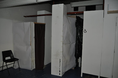
For this project we were split into groups of six and we were made to build or show something that represented our experience of Hospitalfield. Whilst walking around Hospitalfield our group had strong feelings of being unsettled and there was an unknown eeriness to the place. At the site it was very quiet and the only noises to be heard were the ones creasted by us. This created a feeling of solitude, as if we were the only living things in an almost dead site. There was a lot of plant life within the site and a walled garde at the centre. There were spaces within that were tight and standing in them gave you a feeling of claustrophobia.


We wanted to convey all the feelings we felt so we built an installation to express this. We built a tunnel or maze that would explore a journey of senses. The tunnel had changes in height and floor level to give the sense of unknowing. It was also pitch black and the participant would wear headphones with eerie music to heighten the experience. The walls were covered in textured material so that the participant didn't like what they were touching because of the feeling of unknown. At the end of the tunnel we had a sheet where they had to write one word to describe there experience so that we could see if our installation was effective.

Monday, 3 May 2010

Roof, wall structure and spatial effects of French Romanesque and Gothic churches

During the medieval period the two Architectural styles of Romanesque and Gothic were created and used in great success in the forms of large cathedrals. The Romanesque period flourished from the 10th to the 12th century and the successor to this was the Gothic movement which lasted from the 12th to the 16th century. There were great technological advances during this time to spread the loads and forces of the building, through the walls down to the ground, which in turn meant that the Architects could create dramatic, large, spacious buildings.

The Romanesque period brought about the use of more robust, fireproof materials, i.e. stone, which gave the cathedrals a more solid and heavy looking structure. The new introduction of creating buildings created entirely of stone proved to be a difficult challenge. Only through the continuous trial and error did they overcome this problem. As Fazio et al (2003) describe Romanesque buildings as a great series of experiments to enclose and illuminate interior space, using incombustible masonry construction to reduce the chances of fire and thus protect the valuable relics held in churches.

Greek spans were limited by narrowly spaced columns, but the Romans wanted to build large, unobstructed spaces and so used vaults on an unprecedented scale. A timber roof works in tension, because the vertical loads are distributed along the beams, but stone has limited tensile capabilities and works best in compression. The arch answers this problem by working only in compression. (Borden, Elzanowski et al 2008). This, along with barrel vaults and groin vaults, were some of the main features that are associated with Romanesque cathedrals.


The roman arch was built by building the stone work around a semi-circular frame and then was held in place by putting a keystone in the centre. The most important structural developments of Romanesque architecture is the vault. The vault was developed to enable the construction of stone roofs. The barrel vault was created by extending the arch horizontally which meant that much greater areas were able to be covered that were not possible with the post and lintel construction. There was one major problem with the barrel vault, the forces of the arch would cause the side walls to buckle. To overcome this, the walls of a Romanesque church were very thick and were built with windows being used sparingly as they reduced the structural integrity.


The groin vault is the result of the intersection of two barrel vaults of equal diameter at right angles to each other. The points of intersection form paraboloids that are known as groins (Borden, Elzanowski et al 2008). The innovation of creating this structure meant that the stresses from the roof could be directed to the four corners and down the point supports to the ground. As well as being a more structurally stable design it also gave the opportunity to link two volumes together.

The Romanesque movement gave the space within the churches a feeling of grandeur because of the high vaulted ceilings and stone walls. Your eyes are immediately drawn to the alter on the far side as soon as you enter. Within the space you can get a sense of tranquillity because of the abundance of curves and slithers of natural light entering the building.

The Gothic style succeeded the Romanesque style and originated in a region near Paris called Ile-de-France. Unlike Romanesque buildings, in which a continuous mass of wall is necessary to sustain the load, the Gothic structure is a skeletal system that transfers roof loads down to the ground at discrete points, thereby freeing large expanses of wall to be opened for windows. One can define Gothic buildings by their spatial characteristics, which tend to emphasize the vertical, consist of articulated but unified cells of space, and have a sense of openness afforded by the construction (Fazio et al 2003). The key attributes associated with Gothic architecture are the pointed arches, rib vaults and flying buttresses.


The pointed arch was used in Islamic culture before it was eventually inducted into medieval Architecture. During the Gothic era, builders discovered that pointed arches would give structures amazing strength and stability. In Gothic buildings, the weight of the roof was supported by the arches rather than the walls. This meant that walls could be thinner. As Fazio et al (2003) discuss that pointed arches are better approximations of catenary curves that represent the line of compressive force acting in any arch, and thus they exert less outward thrust. They also present considerable design flexibility, as one can vary to some extent the angle of the arch. Steeper angles generate less thrust. This was a great revelation as the architects could now raise vaults to higher than was possible in Romanesque architecture.


Ribbed vaulting functions in much the same manner as plain groined vaulting, except that it is reinforced with ribs, and can be made much thinner. The vault uses a pillars, permitting the walls to be hollowed out and thus, filled with windows, while also allowing the vaults to extend higher. Such light, skeletal construction employing cross ribbed-vaults replaced the massiveness of Romanesque vaults. This had the revolutionary effect of opening up the interior space of a large building such as a church.

The new use of piers to distribute the loads rather than along a thick wall meant that Gothic architects needed to reinforce the structure at strategic points, thus the flying buttress was created. The buttress join the skeletal structure at these points and are set at right angles. They extend externally and attach to another structure to divert the loads from the roof.
The new structural techniques encouraged medieval architects to be more adventurous with their designs because they could now build to heights that were not conceivable before. This meant that the majority of Gothic cathedrals had very large naves, towers and spires.
With the reinforcement provided by external buttresses, entire wall sections could be devoted to windows, particularly in the clerestory, where increased window height and width contributed to a diaphanous interior effect. Window tracery was introduced and became increasingly slender, evolving for plate tracery (punched openings in a solid field) to bar tracery (thin lines of cut stone set in geometric patterns). (Fazio et al 2003). This abundance of light that was entering the building successfully gave that spiritual, tranquil building that one would be looking for when entering a cathedral.


The design of the cathedrals were very aesthetically pleasing because in many cases they were the main focal points of cities. There would be figures carved into the walls, such as apostles. The spires of the cathedrals would be highly decorated with masonry techniques. The windows would often be filled with very colourful stained glass depicting various passages of the bible.

Gothic and Romanesque cathedrals were very different in terms of structure and aesthetics but it was easy to see the different spatial effects that were being achieved by the use of both of the techniques. . Whereas the Romanesque gave you the feeling of tranquillity. Gothic architecture gave the impression of majestic, spiritual, grand and light filled building.

Scottish Parliament

Scottish Parliament


Do you want classic columns and predictable pediments? A growl of old Gothic grandeur? A blissfully boring box? Not here, no thanks! No icon, no IKEA, no iceberg, but curves and caverns, nooks and niches, huddles and heavens syncopations and surprises. Leave symmetry to the cemetery. (Open the doors! E. Morgan)

This little extract is exactly what best describes the emotions that are felt when one thinks of the Scottish parliament building. In 1997 there was a referendum where the Scottish population voted to the creation of a Scottish parliament. With this act there was a need for a new building which would represent a modern Scotland, a parliament where nothing is done un-noticed by the people.

In 1998 Enric Miralles from EMBT, with Edinburgh based RMJM, won the competition to design the new building. His main concept was a building which grew from the landscape in a petal and stem shape. The theme of nature is very obvious with the abundance of natural light and natural ventilation. Many parts of the building are covered in vegetation that is elevated to the windows so that when a politician looks out, they see the Scottish landscape. In 1999 construction started on the building but Enric Miralles died in July 2000; his widow, Benedetta Tagliabue, took over as one of the lead architects. The building was finally opened in 2004.


The entrance hall is the first place that one enters and there are 3 very large concrete vaults which holds the debating chamber above. The vaults are meant to be an abstract representation of the solitaire. A light well in each of the three vaults allows natural light to penetrate the space. These vaults give a good representation of a solid building and in turn a solid government. Also this is where all the public enter which gives the impression of the public are “supporting” the debating chamber and without them there would be nothing.


The floor of the chamber contains seating for 128 members, plus additional seats for the Lord Advocate and Solicitor General, in a semi-circular lay out. The Public, Press and Guest galleries are on the next level. At gallery level there are views out over the landscaping towards the Palace of Holyrood house and Salisbury Crags (http://www.arcspace.com). The room itself is supposed to interact with the public because they are so close to the politicians. The seating arrangement in a semi-circular shape gives a non confrontational style to the chamber as opposed to Westminster where opposing parties sit opposite eachother. To further emphasise this, there are no labels to justify where a single member of parliament should sit. To reiterate Miralles’s idea of nothing goes un-noticed there are abstract forms within the windows which are meant to represent a human figure so that even when there is no one in the viewing gallery, the politicians are still being watched.


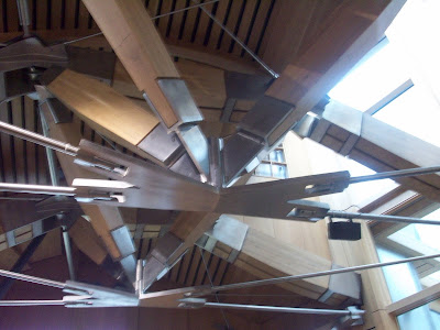
The roof structure of the debating chamber is a very intriguing one because the space with it is so vast and open with no use of pillars to obstruct the view. As arcspace.com say the roof structure, of laminated oak beams and 111 stainless steel nodes (connecting joints), each slightly different, is clearly visible from within the chamber. Amongst the skeletal system there are 276 lights which are there so that no matter where a politician sits they will always have a light focusing on them.


The MSP foyer space is the social centre of the complex, linking all the areas of the building. The foyer roof consists of a curved roof plane into which are located 13 leaf-shaped roof lights of differing sizes and orientations, allowing natural light to flood the space.
Many of the steel panels around the roof lights have cut -outs which form the shape of part of the map of the west coast of Scotland. Looking beyond the cut-out, the shape of the panels which feature on the façades of many of the buildings can be seen. These panels have a functional use as behind them are vents, linked to the building management system, which open automatically to allow natural ventilation to circulate around the Garden Lobby.

The materials used within the building tried to be local: oak was used on the exterior of the building to imitate bamboo and within the debating chamber; Kemnay granite and concrete from Dunbar is used throughout; Caithness stone for flooring.


The original budget for the Scottish parliament building was £40 million but by the end of the project it had increased drastically to £431 million. This was a big reason why the building was scrutinised so much by the public. In my opinion to get a building which successfully represents the start of a truly modern Scotland and effectively involves the public throughout all the spaces, money should not be taken into account when thinking of national pride.

Friday, 5 March 2010

tower project

Tower Project


For this project we were put into groups of four and were expected to design a 20m tower to be placed in Tentsmuir forest. We only had a week to design it and create a 1:10 model.


We came up with the design of rectilinear shapes canterlevering off of eachother. It would be a steel frame construction with tesion wires at the top section. There would be a timber facade hung off the frame. The structure would be exposed and there are 4 main viewing platforms on your way up the tower.


final model study

Final Model


For the final design for my habitat project, I was really influenced by Mies van der Rohe. His Barcelona Pavillion had the big extending walls and overhanging roofs which i brought foward to this project. His extended planes sectioned off the site into specific areas just as in my site the extended walls section my site into three specific areas. The driveway, The commercial and the residential. Light was the main focal point of my building to help emphasise the views. As can be seen with the big glass facade, the clients get the beautiful view of the hills and the loch.