Friday, 7 May 2010

Mediator (jan18th-feb 5th)

Mediator
For this project we were split into groups of six and we were made to build or show something that represented our experience of Hospitalfield. Whilst walking around Hospitalfield our group had strong feelings of being unsettled and there was an unknown eeriness to the place. At the site it was very quiet and the only noises to be heard were the ones creasted by us. This created a feeling of solitude, as if we were the only living things in an almost dead site. There was a lot of plant life within the site and a walled garde at the centre. There were spaces within that were tight and standing in them gave you a feeling of claustrophobia.


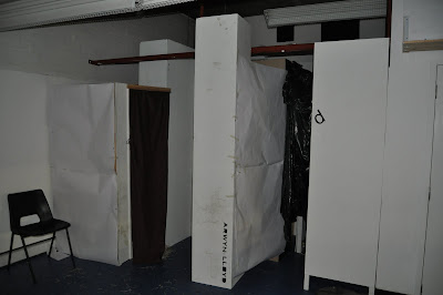
We wanted to convey all the feelings we felt so we built an installation to express this. We built a tunnel or maze that would explore a journey of senses. The tunnel had changes in height and floor level to give the sense of unknowing. It was also pitch black and the participant would wear headphones with eerie music to heighten the experience. The walls were covered in textured material so that the participant didn't like what they were touching because of the feeling of unknown. At the end of the tunnel we had a sheet where they had to write one word to describe there experience so that we could see if our installation was effective.

Monday, 3 May 2010

Roof, wall structure and spatial effects of French Romanesque and Gothic churches

During the medieval period the two Architectural styles of Romanesque and Gothic were created and used in great success in the forms of large cathedrals. The Romanesque period flourished from the 10th to the 12th century and the successor to this was the Gothic movement which lasted from the 12th to the 16th century. There were great technological advances during this time to spread the loads and forces of the building, through the walls down to the ground, which in turn meant that the Architects could create dramatic, large, spacious buildings.

The Romanesque period brought about the use of more robust, fireproof materials, i.e. stone, which gave the cathedrals a more solid and heavy looking structure. The new introduction of creating buildings created entirely of stone proved to be a difficult challenge. Only through the continuous trial and error did they overcome this problem. As Fazio et al (2003) describe Romanesque buildings as a great series of experiments to enclose and illuminate interior space, using incombustible masonry construction to reduce the chances of fire and thus protect the valuable relics held in churches.

Greek spans were limited by narrowly spaced columns, but the Romans wanted to build large, unobstructed spaces and so used vaults on an unprecedented scale. A timber roof works in tension, because the vertical loads are distributed along the beams, but stone has limited tensile capabilities and works best in compression. The arch answers this problem by working only in compression. (Borden, Elzanowski et al 2008). This, along with barrel vaults and groin vaults, were some of the main features that are associated with Romanesque cathedrals.


The roman arch was built by building the stone work around a semi-circular frame and then was held in place by putting a keystone in the centre. The most important structural developments of Romanesque architecture is the vault. The vault was developed to enable the construction of stone roofs. The barrel vault was created by extending the arch horizontally which meant that much greater areas were able to be covered that were not possible with the post and lintel construction. There was one major problem with the barrel vault, the forces of the arch would cause the side walls to buckle. To overcome this, the walls of a Romanesque church were very thick and were built with windows being used sparingly as they reduced the structural integrity.


The groin vault is the result of the intersection of two barrel vaults of equal diameter at right angles to each other. The points of intersection form paraboloids that are known as groins (Borden, Elzanowski et al 2008). The innovation of creating this structure meant that the stresses from the roof could be directed to the four corners and down the point supports to the ground. As well as being a more structurally stable design it also gave the opportunity to link two volumes together.

The Romanesque movement gave the space within the churches a feeling of grandeur because of the high vaulted ceilings and stone walls. Your eyes are immediately drawn to the alter on the far side as soon as you enter. Within the space you can get a sense of tranquillity because of the abundance of curves and slithers of natural light entering the building.

The Gothic style succeeded the Romanesque style and originated in a region near Paris called Ile-de-France. Unlike Romanesque buildings, in which a continuous mass of wall is necessary to sustain the load, the Gothic structure is a skeletal system that transfers roof loads down to the ground at discrete points, thereby freeing large expanses of wall to be opened for windows. One can define Gothic buildings by their spatial characteristics, which tend to emphasize the vertical, consist of articulated but unified cells of space, and have a sense of openness afforded by the construction (Fazio et al 2003). The key attributes associated with Gothic architecture are the pointed arches, rib vaults and flying buttresses.


The pointed arch was used in Islamic culture before it was eventually inducted into medieval Architecture. During the Gothic era, builders discovered that pointed arches would give structures amazing strength and stability. In Gothic buildings, the weight of the roof was supported by the arches rather than the walls. This meant that walls could be thinner. As Fazio et al (2003) discuss that pointed arches are better approximations of catenary curves that represent the line of compressive force acting in any arch, and thus they exert less outward thrust. They also present considerable design flexibility, as one can vary to some extent the angle of the arch. Steeper angles generate less thrust. This was a great revelation as the architects could now raise vaults to higher than was possible in Romanesque architecture.


Ribbed vaulting functions in much the same manner as plain groined vaulting, except that it is reinforced with ribs, and can be made much thinner. The vault uses a pillars, permitting the walls to be hollowed out and thus, filled with windows, while also allowing the vaults to extend higher. Such light, skeletal construction employing cross ribbed-vaults replaced the massiveness of Romanesque vaults. This had the revolutionary effect of opening up the interior space of a large building such as a church.

The new use of piers to distribute the loads rather than along a thick wall meant that Gothic architects needed to reinforce the structure at strategic points, thus the flying buttress was created. The buttress join the skeletal structure at these points and are set at right angles. They extend externally and attach to another structure to divert the loads from the roof.
The new structural techniques encouraged medieval architects to be more adventurous with their designs because they could now build to heights that were not conceivable before. This meant that the majority of Gothic cathedrals had very large naves, towers and spires.
With the reinforcement provided by external buttresses, entire wall sections could be devoted to windows, particularly in the clerestory, where increased window height and width contributed to a diaphanous interior effect. Window tracery was introduced and became increasingly slender, evolving for plate tracery (punched openings in a solid field) to bar tracery (thin lines of cut stone set in geometric patterns). (Fazio et al 2003). This abundance of light that was entering the building successfully gave that spiritual, tranquil building that one would be looking for when entering a cathedral.


The design of the cathedrals were very aesthetically pleasing because in many cases they were the main focal points of cities. There would be figures carved into the walls, such as apostles. The spires of the cathedrals would be highly decorated with masonry techniques. The windows would often be filled with very colourful stained glass depicting various passages of the bible.

Gothic and Romanesque cathedrals were very different in terms of structure and aesthetics but it was easy to see the different spatial effects that were being achieved by the use of both of the techniques. . Whereas the Romanesque gave you the feeling of tranquillity. Gothic architecture gave the impression of majestic, spiritual, grand and light filled building.

Scottish Parliament

Scottish Parliament


Do you want classic columns and predictable pediments? A growl of old Gothic grandeur? A blissfully boring box? Not here, no thanks! No icon, no IKEA, no iceberg, but curves and caverns, nooks and niches, huddles and heavens syncopations and surprises. Leave symmetry to the cemetery. (Open the doors! E. Morgan)

This little extract is exactly what best describes the emotions that are felt when one thinks of the Scottish parliament building. In 1997 there was a referendum where the Scottish population voted to the creation of a Scottish parliament. With this act there was a need for a new building which would represent a modern Scotland, a parliament where nothing is done un-noticed by the people.

In 1998 Enric Miralles from EMBT, with Edinburgh based RMJM, won the competition to design the new building. His main concept was a building which grew from the landscape in a petal and stem shape. The theme of nature is very obvious with the abundance of natural light and natural ventilation. Many parts of the building are covered in vegetation that is elevated to the windows so that when a politician looks out, they see the Scottish landscape. In 1999 construction started on the building but Enric Miralles died in July 2000; his widow, Benedetta Tagliabue, took over as one of the lead architects. The building was finally opened in 2004.


The entrance hall is the first place that one enters and there are 3 very large concrete vaults which holds the debating chamber above. The vaults are meant to be an abstract representation of the solitaire. A light well in each of the three vaults allows natural light to penetrate the space. These vaults give a good representation of a solid building and in turn a solid government. Also this is where all the public enter which gives the impression of the public are “supporting” the debating chamber and without them there would be nothing.


The floor of the chamber contains seating for 128 members, plus additional seats for the Lord Advocate and Solicitor General, in a semi-circular lay out. The Public, Press and Guest galleries are on the next level. At gallery level there are views out over the landscaping towards the Palace of Holyrood house and Salisbury Crags (http://www.arcspace.com). The room itself is supposed to interact with the public because they are so close to the politicians. The seating arrangement in a semi-circular shape gives a non confrontational style to the chamber as opposed to Westminster where opposing parties sit opposite eachother. To further emphasise this, there are no labels to justify where a single member of parliament should sit. To reiterate Miralles’s idea of nothing goes un-noticed there are abstract forms within the windows which are meant to represent a human figure so that even when there is no one in the viewing gallery, the politicians are still being watched.


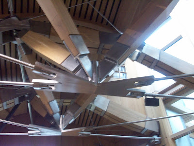
The roof structure of the debating chamber is a very intriguing one because the space with it is so vast and open with no use of pillars to obstruct the view. As arcspace.com say the roof structure, of laminated oak beams and 111 stainless steel nodes (connecting joints), each slightly different, is clearly visible from within the chamber. Amongst the skeletal system there are 276 lights which are there so that no matter where a politician sits they will always have a light focusing on them.


The MSP foyer space is the social centre of the complex, linking all the areas of the building. The foyer roof consists of a curved roof plane into which are located 13 leaf-shaped roof lights of differing sizes and orientations, allowing natural light to flood the space.
Many of the steel panels around the roof lights have cut -outs which form the shape of part of the map of the west coast of Scotland. Looking beyond the cut-out, the shape of the panels which feature on the façades of many of the buildings can be seen. These panels have a functional use as behind them are vents, linked to the building management system, which open automatically to allow natural ventilation to circulate around the Garden Lobby.

The materials used within the building tried to be local: oak was used on the exterior of the building to imitate bamboo and within the debating chamber; Kemnay granite and concrete from Dunbar is used throughout; Caithness stone for flooring.


The original budget for the Scottish parliament building was £40 million but by the end of the project it had increased drastically to £431 million. This was a big reason why the building was scrutinised so much by the public. In my opinion to get a building which successfully represents the start of a truly modern Scotland and effectively involves the public throughout all the spaces, money should not be taken into account when thinking of national pride.

Friday, 5 March 2010

tower project

Tower Project


For this project we were put into groups of four and were expected to design a 20m tower to be placed in Tentsmuir forest. We only had a week to design it and create a 1:10 model.


We came up with the design of rectilinear shapes canterlevering off of eachother. It would be a steel frame construction with tesion wires at the top section. There would be a timber facade hung off the frame. The structure would be exposed and there are 4 main viewing platforms on your way up the tower.


final model study

Final Model


For the final design for my habitat project, I was really influenced by Mies van der Rohe. His Barcelona Pavillion had the big extending walls and overhanging roofs which i brought foward to this project. His extended planes sectioned off the site into specific areas just as in my site the extended walls section my site into three specific areas. The driveway, The commercial and the residential. Light was the main focal point of my building to help emphasise the views. As can be seen with the big glass facade, the clients get the beautiful view of the hills and the loch.


Sunday, 13 December 2009

Precedents


Adolf Loos

Michaelerplatz


This building is one of the most famous of Adolf Loos and the first made with mixed uses, such as building housing plurifamiliar, and shop. The project was commissioned by the firm Goldman & Salatsch tailors who were once again the "patron" of Loos and occupy the lower three floors of the building with one of its largest stores.


This concept was a very interesting one which I wanted to bring forward to my project because my clients insisted on having a meeting room. Which meant I should find a way of clearly separating the buildings by the use of different materials.

Ludwig Mies van der Rohe
Barcelona Pavilion

Mies's response to the proposal by von Schnitzler was radical. After rejecting the original site because of aesthetic reasons, Mies agreed to a quiet site at the narrow side of a wide, diagonal axis, where the pavilion would still offer viewpoints and a route leading to one of the exhibition's main attractions, the "Spanish Village" . The pavilion was going to be bare—no trade exhibits—just the structure, a single sculpture and purpose-designed furniture.


The main idea of this building was the extending walls, which i eagerly brought forward to my final design of my habitat building. I used these extending walls to easily show 3 segregated areas in my site. The commercial, parking and residential. The overhang is an aspect I used on my two building to give the clients an area to stand under when outdoors.

Initial idea

This was my initial idea for the site at Kenmore but was quickly scrapped due to being impractical. It was designed in a pyrimidical style wih the main living area being downstairs and all the sleeping quarters on the rest. It had a very large glass walled living/dining room but as you walked towards it, you felt very constricted. It was not open plan enough. The entrance was meant to be grand but it was a big anti-climax because, as soon as you entered, you were greated by a utility room.


3rd floor plan


The master bedroom area is situated on the 3rd floor with a grand master bedroom and a huge ensuite bathroom. The clients already work in a hierarchical system and it would not be fair for them to live in one. So the idea of Hoyt having a much grander bedroom than the rest was scrapped.


2nd Floor Plan


Ground Floor Plan


Wednesday, 4 November 2009

client specifications

Clients

We had to come up 3 clients who were going to live within the house that we were designing. I came up with 3 work associates of a multimillion pound business. The company was started 20 years ago and are based in the fareast. The company is involved in creating large comercial buildings and large residential developments. They require a new home for the CEO where meetings can also take place. They require somewhere very modern with natural light, a lot of space, a meting room, large windows aswell. They are all keen sailors which is how they met.


Hoyt Strongfeld

CEO

35 years old

comumtes between Jakarta, London, New York and Edinburgh but would like a house on the Tay. He would like somewhere luxurious with plenty of bedrooms and a meeting room.

hobbies- car tuning, gambling, jet skiing, diving, hunting, sky-diving and sailing


Lochland Macloud

Partner

32 years old

Based in London and Edinburgh. He would use the building as a holday retreat and also as a place to bring clients to close deals.

hobbies- partying, clay pigeon shooting , rugby and sailing


Angela Smith

Engaged to Hoyt

CFO

29 years old

Based in Edinburgh. She would like some panaramic views of the hills and the loch with lots of natural light. She would like a large open plan layout for entertaining.

hobbies- scree running, sailing, fine dining and music

Friday, 30 October 2009

Site visit to Kenmore (23rd oct)


On Friday (23rd October) we visited Loch Tay to see the location of our site for the next project our habitat project. When visiting Kenmore we also visited the crannog centre to understand how crannogs were built in the iron age. This was very interesting to see the sophisticated techniques that were used, that were not only very vernacular but very durable as well. As we found out that some of the supporting timbers that were being excavated were still in great condition.


The village itself is very small with very few houses. The buildings around the main square haven’t changed in over a hundred years. Walking round the village it was easy to see there was a lack of industry which meant the main income was tourism. The views on the lochside were absoloutely fantastic.


When we arrived at the site I realised that we actually had quite a lot of room to work with and the views again from the site were breathtaking. The views to the west were the best with an obstructed view of the valley. The south views is good with nice views of the opposite hills which have a few buildings on it. The site itself is very exposed which will be a problem with the prevailing westernly wind. There were only buildings to the north of the site which was an absolute bonus when it comes to the matter of privacy.

Wednesday, 14 October 2009

Analysis of precedent (25th sep- 16th oct)


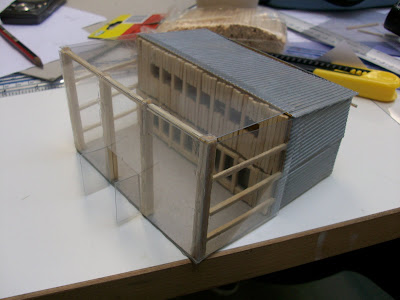
This project was the 4th project we were given. It consisted of studying a given building over the following 3 weeks. Working in groups of 3 various models, drawings and sketches were gathered for our final review. We were assigned Maison Lapatie by Vassal and Lacaton. The building is suituated in the inner suburbs of Bordeaux and is in a run down area without many aesthetically pleasing features. It was a low budget project built in 1993 and was one of their first projects. The building itself isn’t very pleasing to the eye in my opinion but after studying it in greater detail I can understand to reasoning behind their concept and also the clients specifications.


Lacaton and Vassal worked for sometime in Africa which is where they developed their techniques and philosophies of building structures that were: durable; easily replaceable; replicable; cost efficient and functional. These ideas were brought forward to Lapatie as it can be easily seen by the materials chosen.


The house is built out of a steel structure with opaque fibre-cement sheeting on the street side facade and transparent PVC is used for the greenhouse in the back garden. The use of PVC to create greenhouses can be seen in other bigger projects such as the day care centre in Begles the year later. It is almost recognised as their trademark. Their usage of eternit fibre cement sheeting had very strong agruments to support it: 30 year guarentee; doesn't rust; very good insulation; durable; easy to replace; light which means a lowering in transport costs and a lowering in the overall budget.


As mentioned earlier the project was low budget, only costing 55 000 euros, and the clients wanted something different but affordable. They wanted something open plan with lots of natural light as there is a lack of partition walls and an abundance of windows. The conservatory with high ceilings must have been a big factor because it can be used as extra living space during the summer furthermore the conservatory could have been restriceted to one storey. Lots of windows and hatches are situated on both sides of the house which can be opened to give lots of ventilation. The garden must have been the biggest factor in this project because with the floorspace of the building it could have easily been stretched out as a one storey bungalow. They obiously want to keep the garden and the also had a small patch of grass put into the conservatory.


For this project we had to draw all the elevations, plans and sections. We also made a 1:100 representative model and a 1:100 site plane. Two 1:50 colour coded volumetric models and a 1:50 acetate circulation model.